Mobile App Development, zBlog
Human Centered Design Process: Enhancing UX of a Mobile App
Introduction
Creating an intuitive, user-friendly mobile app takes more than just technical skills. It requires a human-centered design process that deeply understands users’ needs and behaviors. A human-centered design process puts real people at the heart of the process to build an experience that feels made just for them. Follow these steps to design a high-quality mobile app focused on great UX.
Conduct User Research
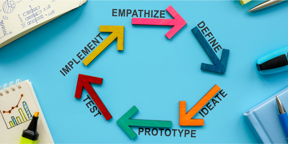
The first step is learning about your target users through research:
- Create user personas based on your ideal customer demographics, motivations, values, and goals. Develop empathy for what they think, feel, and experience.
- Interview current and prospective app users about their needs and pain points. Ask about their lifestyle, habits, and how they would use your app.
- Observe how users interact with current solutions in context. Identify usability issues and interaction patterns.
- Survey existing users on features they value most and areas for improvement. Gather feedback on proposed app concepts.
- Analyze app store reviews and social media discussions around user sentiment. Look for common complaints and requests.
Thorough user research provides insights you can use to guide the app’s design to best meet user needs.
Define the App Purpose
Synthesize your user research to clearly define the core purpose of your app. Align on how it will add value to users’ lives by:
- Solving a key frustration or fulfilling an important need
- Simplifying a complex process
- Saving time on a daily task
- Providing access to useful information
- Delivering fun, engaging experiences
- Accomplishing a specific goal
- Improving an existing solution
Focus the app experience around this clearly defined purpose meaningful to users.
Map the User’s Journey

Visually map out the end-to-end user journey through your app. Chart the step-by-step flow across key tasks and pages. Consider actions like:
- Downloading and onboarding
- Login and authentication
- Consuming main content
- Interacting with key features
- Completing transactions
- Accessing settings and help information
- Sharing via social media or contacts
- Checking notifications
- User account management
Outline how users will logically move through the app to accomplish goals and fulfill needs. Work to minimize steps and simplify flows.
Wireframe and Prototype
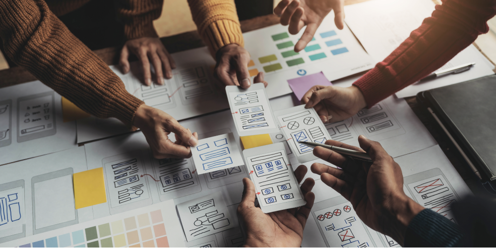
Wireframe key screens and interfaces to visualize the information hierarchy and layout. Use simple black-and-white sketches without styling.
- Show the placement of main elements like navigation, content, buttons, and menus
- Indicate how visual components will display and adapt across mobile and tablet form factors
- Provide Wireframes for critical app journeys and priority interfaces
Create an interactive prototype to simulate the user flow through screens and test concepts. Collect feedback through demos and usability studies. Refine workflows based on findings.
Design Visual Interfaces
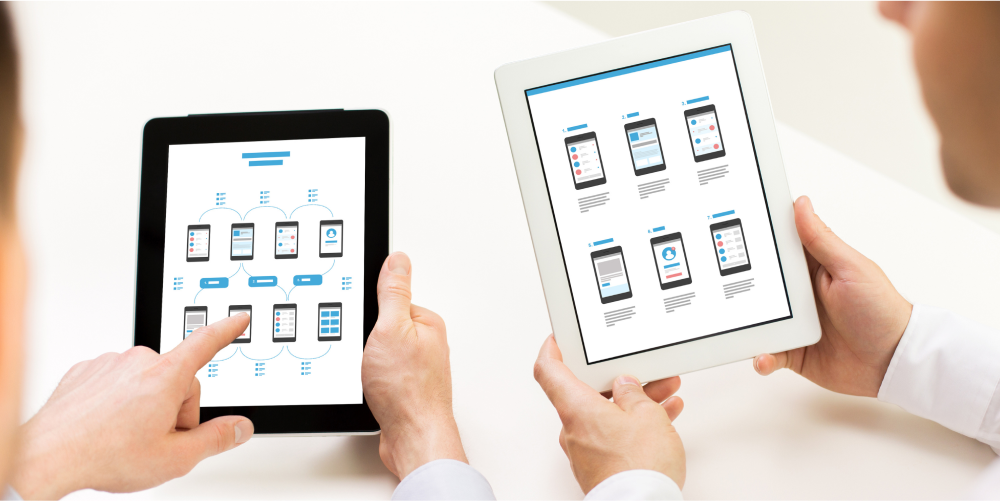
Apply visual and interaction design principles to bring wireframes to life:
- Organize content and functionality intuitively following conventions and mental models users expect
- Make key actions prominent with strategic visual hierarchy, positioning, size, color, and contrast
- Minimize cognitive load with clear communication, Familiar patterns, and unambiguous icons/imagery
- Apply appropriate styling like brand identity, imagery, typography, and color palette to enhance aesthetics
Maintain usability and simplicity as the top priorities over flashy visuals. Follow platform interface guidelines for an intuitive native look and feel.
Build Out Detailed Specs
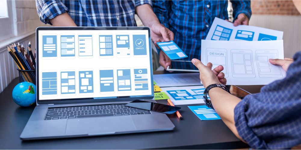
Compile a detailed specification document including:
- Finalized user flows and sitemaps
- Comprehensive wireframes for all screens/states
- Visual mockups showing colors, typography, imagery
- User interface specification including UI patterns, gestures, transitions, animations
- Interaction and micro-interaction design specifics
- Design a system describing reusable elements like buttons, icons, typography, etc.
Thorough specifications ensure your vision is translated accurately into the final product by in-house or capable outsourced product development teams.
Test and Iterate

Conduct usability testing on prototypes with real users early and often. Observe how they navigate flows, access information, and perform tasks. Gather direct feedback on what they find confusing or problematic.
Feed insights back into the design cycle to quickly iterate and enhance the UX. Test again until you have clear validation that the app delivers value simply and intuitively.
Case Study: Trantor’s Human-Centered Shopping App
Let’s examine how the Trantor UX team leveraged a human-centered design process to design an intuitive mobile shopping experience.
- Research
Trantor conducted in-depth customer interviews and surveys for an e-commerce retailer to uncover shopping pain points and wish list capabilities. Personas represented the app’s target demographics. - Purpose
The research revealed customers wanted a fast, seamless mobile way to shop the extensive catalog anytime, anywhere. Trantor defined the app’s purpose as streamlining shopping through personalized recommendations and speedy checkout. - User Journey
Trantor storyboarded the full end-to-end user journey from signup to purchase. Key user flows focused on product browsing, cart management, and accelerated checkout. - Prototyping
The team wireframed the information architecture and UI design before creating interactive prototypes. These were tested with customers for feedback. - Visual Design
Final UI visuals optimized for usability with clear calls-to-action, minimal purchase steps, and clean aesthetics matching the client’s brand. - Specification
Trantor compiled detailed UX documentation so the final product matched the human-centered vision and accelerated developer handoff. - Testing
Multiple rounds of customer-validated testing refined flows and UI elements, informing ongoing design iterations.
The result of Trantor’s human-centered process was an intuitive, best-in-class mobile shopping experience flawlessly tailored to customer needs. This real-world case study demonstrates the immense value of putting the user at the heart of mobile app design.
By deeply understanding user needs, goals, and behaviors, you can craft a human-centered mobile app experience that truly resonates with your audience. Maintain this customer focus throughout the design process via research, prototyping, iteration, and testing. Understand the UX trends shaping the businesses and leverage them to build a product users naturally love.
Conclusion
In essence, mobile app development with a human-centered approach is about creating a customer experience that users truly enjoy and find valuable. By prioritizing user research, defining clear purposes, mapping user journeys, wireframing, designing visual interfaces, building detailed specifications, and continuously testing and iterating, you ensure that your app resonates with your target audience. Through this approach, you can create apps that solve real problems, foster meaningful connections with users, and ultimately lead to customer success, long-term engagement and loyalty.
